


 Your new post is loading...

|
Scooped by Robin Good |

Robin Good's insight:
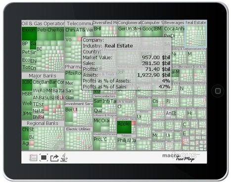
Treemap is a cross-platform treemap visualization downloadable software tool which allows you to import large data collections that are too big to visualize and easily navigate through standard display formats, and to create stunningly effective data displays based on the "treemap" format.
If you are not familiar with it, the treemap data display algorithm works by dividing the data display area "so that the area of each entry is proportional to the data values" it contains.
In addition to the classic treemap layout algorithm, TreeMap also offers additional display formats including squarified variant that harmonizes aspect ratios of the rectangles, the circular tag cloud and Voronoi layouts.
"In terms of interaction, TreeMap provides a zooming interface as well as the possibility to drill-down. Details on demand are available in the form of pop-ups whose content can be freely customized."
Data can be imported from Excel, MySQL / SQL Server / PostgreSQL / Oracle databases and there color, height, labels, relevance can be mapped to any record attribute.
30-day free trial available: http://www.treemap.com/try/
Pricing: $259 for license
N.B.: The Treemap server software ($2495 for internal use - higher rates for public use), allows you to publicly share and publish online all of your treemap visualizations.
My comment: I think that treemaps will revolutionize the way we can organize and make accessible large data sets and collections in ways that are immediately useful for the layman. I wish I could already utilize a technology like this one to organize some of my large tool collections, as however good, the present-day tools just don't cut in when you need to work with medium to large-size collections.
I look forward to lower prices and more user-friendly versions of Treemap to be released and integrated in other data curation apps. There is a fast growing market of companies and individual data curators highly interested in making sense of their data sets.
More info: http://www.treemap.com/
Features: http://www.treemap.com/features/
Free 30-day try-out: http://www.treemap.com/try/
Download (Win, OSX, Linux): http://www.treemap.com/download/
Datasets (that you can play with): http://www.treemap.com/datasets/
Documentation: http://www.treemap.com/documentation/
Check also:
Treemap Server: http://www.treemap.com/server/
Server try-out: http://www.treemap.com/server/try/
Treemap API: http://www.treemap.com/api/
API try-out: http://www.treemap.com/api/try/


This is another post where I recommend that you scroll down to have a look at Robin Good's great commentary. I can not beat his for details. His Scoop.it site is: http://curation.masternewmedia.org/ Thanks Robin!
If you are looking for additional visualization tools for displaying data, TreeMap v. 3.0 offers a classic tree map layout as well as others, like squarified variant, circular, tag cloud and voronoi.
Interesting tool, give it a try