The key to good reporting is making sure your data elicits the thought, implication, or decision that you want to leave the reader with. To do that, you'll need to make smart choices in how you choose and display your data. Here's how.
Get Started for FREE
Sign up with Facebook Sign up with X
I don't have a Facebook or a X account
digital marketing strategy
Think | Visualize strategic marketing planning Curated by malek |
Scooped by malek |
The key to good reporting is making sure your data elicits the thought, implication, or decision that you want to leave the reader with. To do that, you'll need to make smart choices in how you choose and display your data. Here's how.
Rescooped by malek from Digital Brand Marketing |
Neuroscientist Beau Lotto shares with us how perception shapes our world and storytelling, and artist Jonathan Harris shares with us the impact of our online lives to both. Both give us steps to take.
Rescooped by malek from Curation Revolution |
Become storytellers: Modern marketing is less about selling and more about creating brand experiences fueled by brand storytelling. You only have about eight seconds to catch consumers’ attention. To make those seconds count, thoroughly investigate your customers.
Some ways to do this: Start with exhaustive persona profiles to build buyer paths from high-level awareness down to purchase so that you’re creating the right types of offers to deliver the appropriate content at every stage of the buying process.
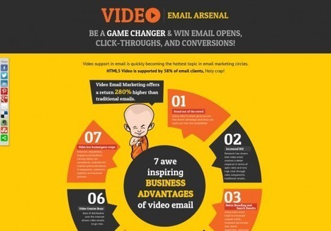
Persona research should include: raw data (surveys, internal sales, and analytics data), interviews with sales and support teams, and discussions with or polls sent to existing customers. Add Interest to Email. Despite news of its demise, email is still a marketing workhorse.
However, businesses must stop the “spray and pray” method in lieu of incorporating smarter strategies driven by automation to get the most out of the medium. Ways to standout in... keep reading
With detailed images, you can get the attention of up to 67% of your targeted audiences.
And,,,,,,,,you can download a free guide
Martin Smith again on the importance of Visual Content Marketing, Storytelling and Persona ! Really Worth Reading !
Rescooped by malek from Content Creation, Curation, Management |
Visage makes infographics easy, and they customize palettes for free.
If you’re an art director at a media outlet, odds are you have to assign and commission each data visualization you publish. That gets time-consuming, even when the graphic in question is nothing but a small pie chart running alongside a feature story.
Visage, a newly launched platform, provides custom templates for graphics. There are myriad tools on the market that do this (for a gander at 30 of them, check out this list), but Visage is the latest, and it's gaining traction with designers at Mashable, MSNBC, and A&E...
Scooped by malek |
These five questions will help give your numbers meaning:
1. Am I presenting or circulating my data?
2. Am I using the right kind of chart or table?
3. What message am I trying to convey?
4. Do my visuals accurately reflect the numbers?
5. Are my data memorable?.
Clarity of purpose is key. If you don't know what you want and where you're going, you'll never get there.
A sink-or-swim list of questions,
Rescooped by malek from Digital Brand Marketing |
As data visualization expands its reach – through the rise of Massive Online Courses, the countless events and, most significantly, the interconnection between different disciplines and knowledge fields that produce inspiring works and innovative projects -, it’s only natural that the number of folks writing about it keeps rising.
There are literally hundreds of interesting blogs out there, covering all the aspects surrounding the production of quality, effective data visualizations.
Visit the link to find a collection of resources and interesting projects that give a pretty good idea of how vast and rich the data visualization community is...
Data visualization is now critical. My favorite of those blogs are Storytelling with data, and Ilovecharts (quite funny although not necessarily business related)
We can learn data visualization news from other bloggers.
Rescooped by malek from Content Curation World |
Interesting tool, give it a try
This is another post where I recommend that you scroll down to have a look at Robin Good's great commentary. I can not beat his for details. His Scoop.it site is: http://curation.masternewmedia.org/ Thanks Robin!
If you are looking for additional visualization tools for displaying data, TreeMap v. 3.0 offers a classic tree map layout as well as others, like squarified variant, circular, tag cloud and voronoi.
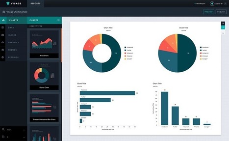
A marketing report is a set of data created to analyze the performance of a specific marketing campaign or effort. It is utilized to effectively communicate a company’s marketing strategy, including research, promotional tactics, goals and expected outcomes.