


 Your new post is loading...


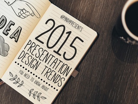
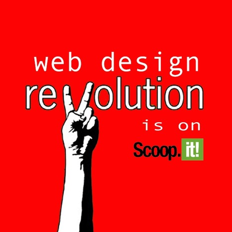
Nine Graphic Design Trends
This post shares nine graphic design trends including:
* Move to Bright Colors
* Color Transitions
* Patterns and Geometry
Read about the other trends on this Web Design Ledger post: https://webdesignledger.com/9-graphic-design-trends-need-aware-2017/?_tmc=Ef7mhzj4NfxCTVDKZ0E0ah3VKpYeh2R183X9wdgYBbk
Via Ana Cristina Pratas, Martin (Marty) Smith, massimo facchinetti

![How Do Consumers Really Feel About 2017's Digital Trends? [Infographic] | digital marketing strategy | Scoop.it](https://img.scoop.it/VzUPuo4gtAoBOMxRD8_CxDl72eJkfbmt4t8yenImKBVvK0kTmF0xjctABnaLJIm9)


![8 User-Generated Content Trends We Learned from 25 Million Facebook Posts [Report] | digital marketing strategy | Scoop.it](https://img.scoop.it/mlBOPDhLuAcItWYeg1g-Zzl72eJkfbmt4t8yenImKBVvK0kTmF0xjctABnaLJIm9)


![Web Design Trends 2015 [Infographic] | digital marketing strategy | Scoop.it](https://img.scoop.it/L41KKlVHAbH6NFwnMzAQbDl72eJkfbmt4t8yenImKBVvK0kTmF0xjctABnaLJIm9)
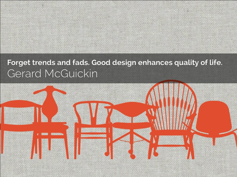


Agree and disagree with some of these trends. The bright colors trend seems obvious, but not when you factor in mobile first. Mobile doesn't handle gradients well thus the great flattening of images into more traditional "web safe" colors. Mobile requires simplification across the board images included.
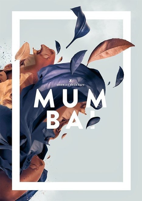
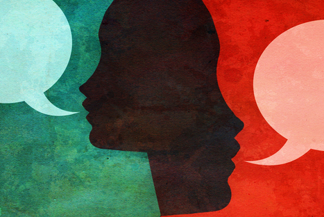
That is NOT to say arresting images don't matter. Arresting images matter more than every since your content must cut through a mountain of clutter. If you're using standard stock cut luck with that "cutting through the clutter" thing.
Better to find arresting images like the one that got my attention long enough to read and scoop this post :). Marty
Marking basically, implies the way the organization logo and hues have been utilized to depict its picture to the outside world. It engraves the item you offer in the psyches of would be clients. It really implies that when one sees these specific hues and outline logo, the principal thing is to recall your image administrations and items. Letterhead Design Services